
Town and Country Homes
Original Finishes and furnishings for Town and Country Homes
By Alison King
I get to tour a lot of Haver Houses. It's one of my favorite things to do. But this home in
Janet Manor (T&C 2) knocked my socks off; it was a virtual time capsule! I have never seen a more intact and well-preserved Town and Country model home. This beauty was offered for sale by Twins & Co. Realty in spring of 2013. It sold within days on the market.
I thought I'd share my thoughts with the community in case homeowners are wondering what elements of their own T&C models are original as well. I invite your input so I can keep this document up to date and more factual. Before long we'll have an accurate idea of how these homes were actually finished when they were sold.
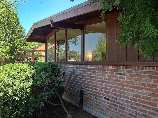
Umber painted redwood is so common that it must have been standard fare. The beams should be chiseled and protrude beyond the roofline. If the brick is looking a little rustic, it was supposed to! The board and batten treatment is definitely original, and the contrast of upper and lower materials is a defining characteristic.
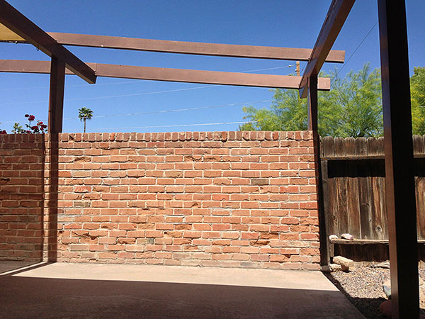
The brick is not supposed to look THIS rustic, though. This wall is showing the wear of age. The beams overhead may be open or covered. I'm standing where the car typically would be parked in the patio-port. If this area was open, the car would have driven between these two posts where the brick wall is. This homeowner chose to have their carport enclosed with the half-height wall to make a larger patio instead. Enclosing the patio-port was an advertised option so there is no right or wrong way to have a patio-port configured.
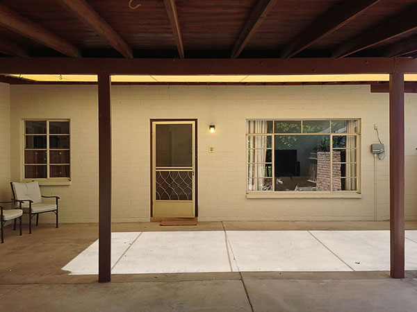
The patio-port is typically half covered and half uncovered in a modular configuration. I'm standing where a car would normally be parked, but the homeowners blocked the area off with the wall, so it's all patio, no port. The characteristic feature this patio is missing is the trademark concrete casting pattern for the pad. Good examples of this can be found in the original
Town and Country Manor (T&C 1) homes.
The side-facing entryway in an unusual quality of T&C homes. Guests walk up from the street and through the patio-port to enter the front door. Many T&C homes have the 13-pane window configuration next to the door, flanked by another 8 pane window.
If you want your home to reflect T&C character, these elements should all be kept, because the patio-port was one of the defining characteristics of the home. You should absolutely have patio furniture out on it and enjoy calling out to your neighbors on the street. Unlike many midcentury home designs, this home does not so much put its back to the street as its front to the side. It is definitely a more social configuration than its contemporaries.
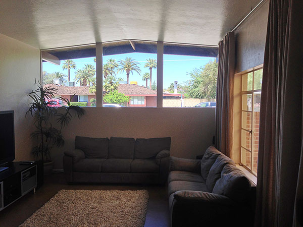
Three panes of half-height windows in the living room are a defining characteristic of the T&C model, and they MUST follow the roofline. You can see the 13-pane window to the right.
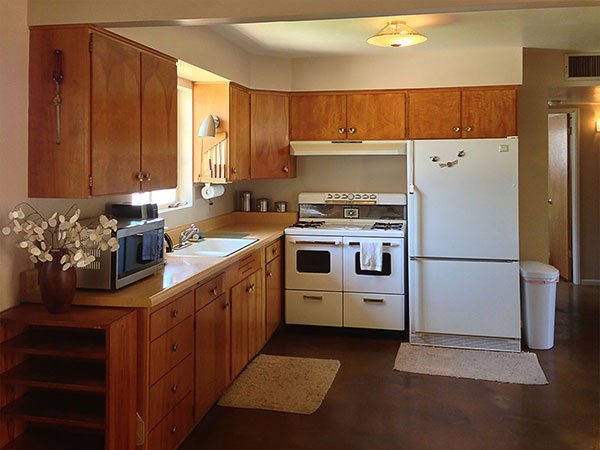
This T&C model is one of the more open plans so the kitchen has more room to be L-shaped instead of U-shaped. We think this wood is birch. Countertops are Formica. Tile was fancier, Formica was more affordable.
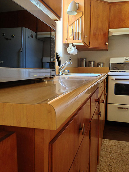
I do not know if the rounded profile and faux wood pattern on this Formica are original or not. I'm guessing not.
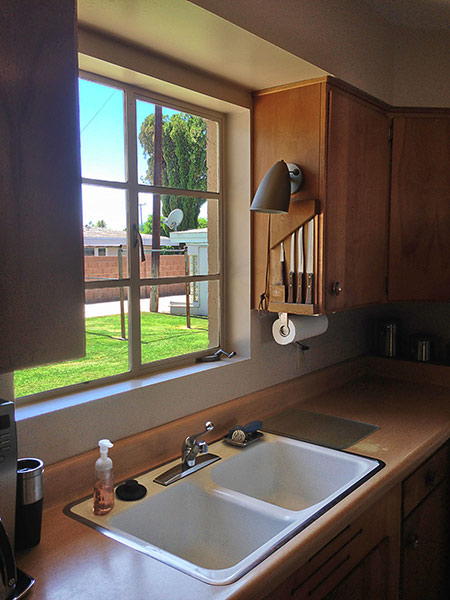
A six-pane casement window with crank in front of kitchen sink was pretty standard.
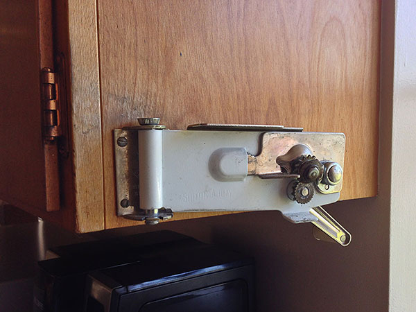
Yowza! What is that? It's a "Swing-A-Way" hand-cranked can opener! It is a virtual miracle that it has survived intact. If it's not vintage, kudos to whomever installed it.
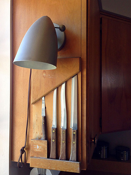
Oh my. Not sure if this original or not but it's not the first time I've seen knives stored in this window space.
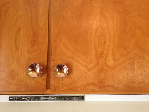
Air-O-Hood vent system above stove. Note that wood grain is nicely (but not expertly) matched in mirror image.
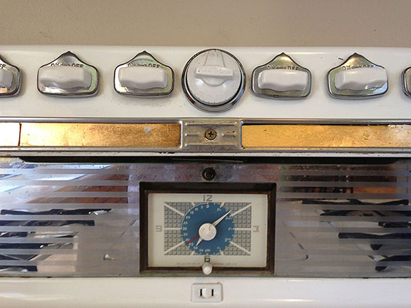
This stove is Robert Shaw brand. T&C 1 ads mention Tappan brand ranges. Not sure what was standard in Janet Manor but sure looks original to me! Note the gold finishes on all the handles and appliances.
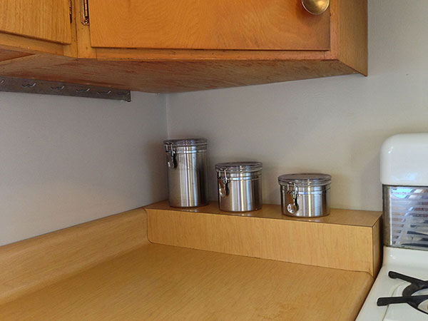
I'm guessing that this shelf is not an original detail.
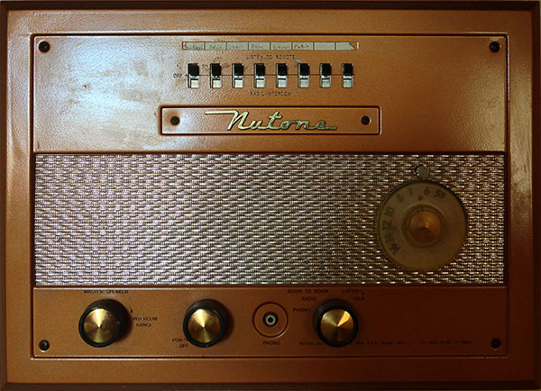
Many T&C homes come with a NuTone radio built into the wall. If your home has one, keep it!
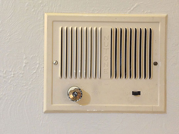
The receiving end of the NuTone system. Ironically these homes are so small that they hardly warrant an intercom system.
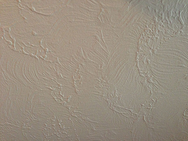
This is a pretty standard interior finishing texture, unfortunately. Not sure if it is original but I've seen it a lot.
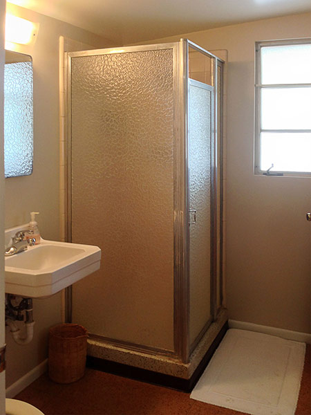
Haver Homes often used this shower unit with aluminum frame and mottled glass. Bravo for you if you can keep it intact!
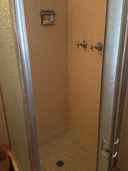
Terrazzo basin is a must-keep if it is in good condition. I've seem them rot out, though, and understand if you have to take them out. Try replacing with more terrazzo!
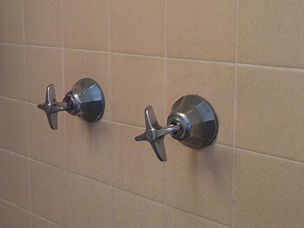
Pink and/or beige Hermosa clay tile by Gladdin McBean & Co. is very standard. I'm presuming these are original fixtures too. Thoughts?
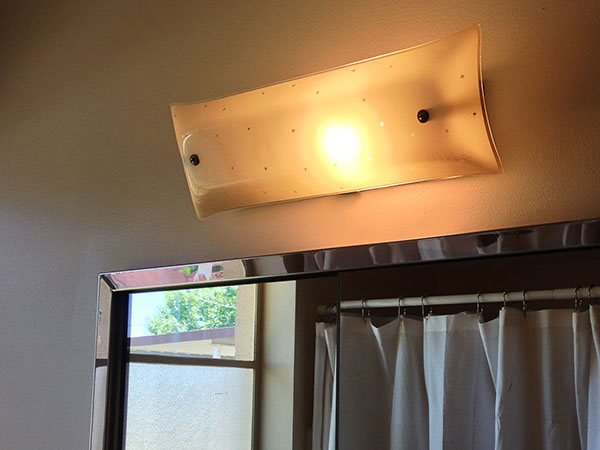
If this isn't an original bathroom vanity fixture, it sure looks like it could be!
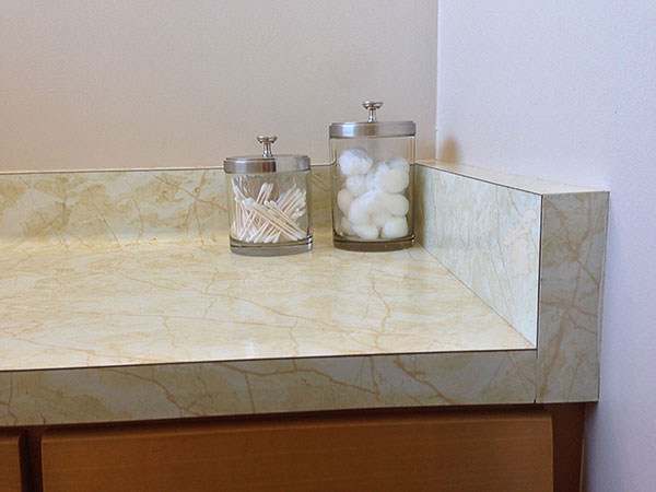
Formica is pretty standard in Haver bathrooms. Not sure if this pattern is period-appropriate or not.
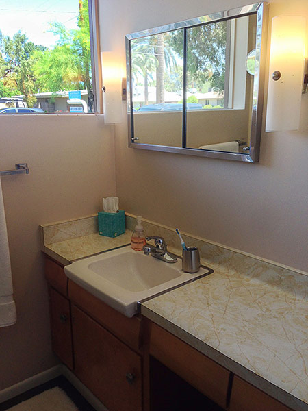
Bumped-out sink and inset medicine cabinet are typical.
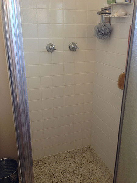
A second terrazzo shower basin with Hermosa tile.
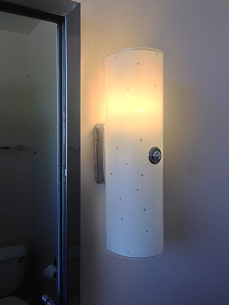
If this fixture isn't original it sure could be!
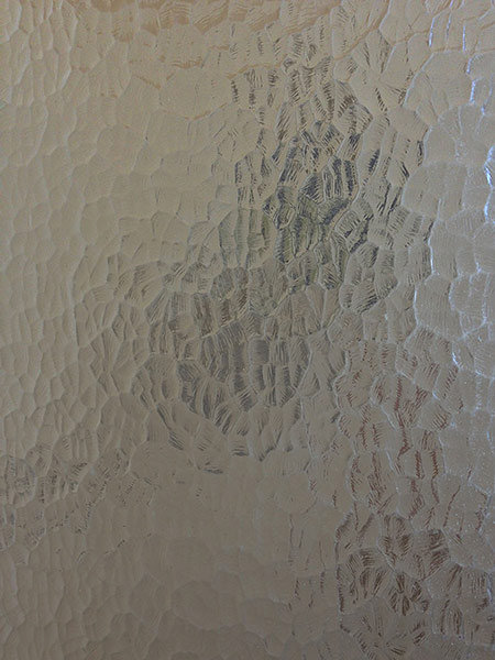
Mottled glass is standard for showers.
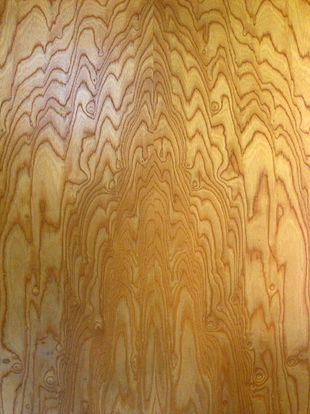
Highly figured birch interior door detail. If you have doors like this keep them unpainted, and if they're painted, consider stripping them.
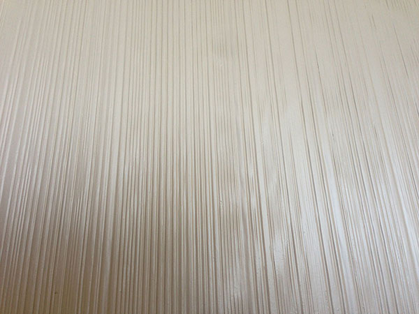
Ribbed facing is used often in Haver Homes, but I'm not sure if it is common in T&C or not.
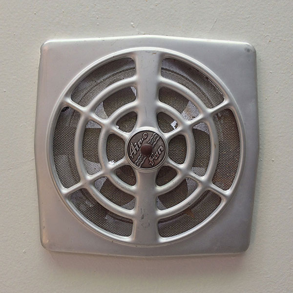
Airo-Fan is a very typical ceiling fan brand seen in Haver Homes across the city.
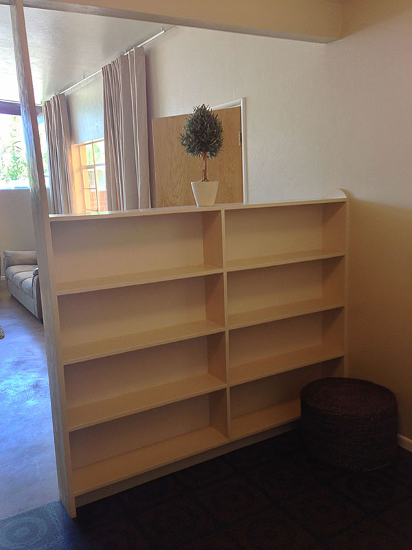
This is a curiosity. It's a bookshelf that separates the living room from a transition to the kitchen. Let me know if your own T&C has such a feature. Many Haver homes came with interior entry walls, like those in
Marlen Grove.
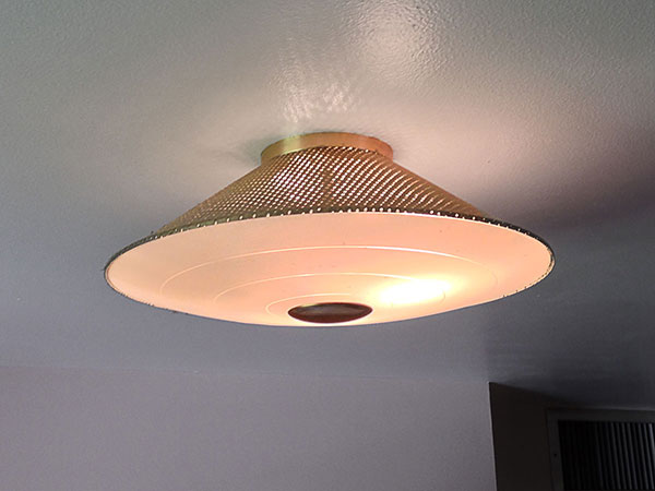
If this fixture is not original, it sure looks like it could be!
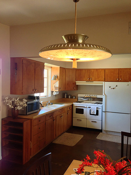
If this saucer-shaped fixture in the dining room next to the kitchen is not original, it also looks like it could be! Note that many appliances and fixtures are gold-tone.
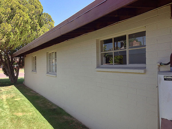
The right side of the home is pretty unremarkable, as is the back.
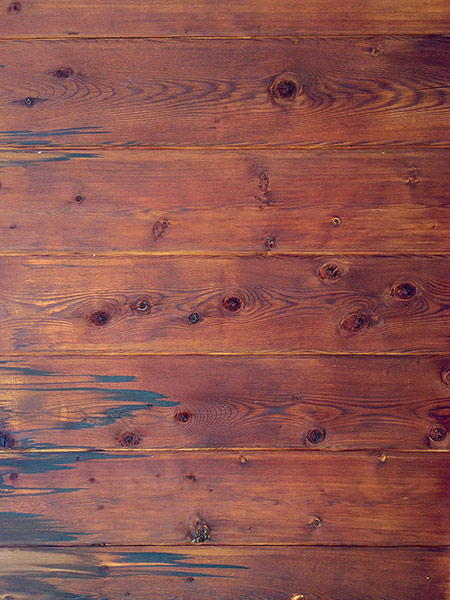
Treatment of the underside of the outdoor eaves.
 Umber painted redwood is so common that it must have been standard fare. The beams should be chiseled and protrude beyond the roofline. If the brick is looking a little rustic, it was supposed to! The board and batten treatment is definitely original, and the contrast of upper and lower materials is a defining characteristic.
 The brick is not supposed to look THIS rustic, though. This wall is showing the wear of age. The beams overhead may be open or covered. I'm standing where the car typically would be parked in the patio-port. If this area was open, the car would have driven between these two posts where the brick wall is. This homeowner chose to have their carport enclosed with the half-height wall to make a larger patio instead. Enclosing the patio-port was an advertised option so there is no right or wrong way to have a patio-port configured.
 The patio-port is typically half covered and half uncovered in a modular configuration. I'm standing where a car would normally be parked, but the homeowners blocked the area off with the wall, so it's all patio, no port. The characteristic feature this patio is missing is the trademark concrete casting pattern for the pad. Good examples of this can be found in the original Town and Country Manor (T&C 1) homes.
The side-facing entryway in an unusual quality of T&C homes. Guests walk up from the street and through the patio-port to enter the front door. Many T&C homes have the 13-pane window configuration next to the door, flanked by another 8 pane window.
If you want your home to reflect T&C character, these elements should all be kept, because the patio-port was one of the defining characteristics of the home. You should absolutely have patio furniture out on it and enjoy calling out to your neighbors on the street. Unlike many midcentury home designs, this home does not so much put its back to the street as its front to the side. It is definitely a more social configuration than its contemporaries.
 Three panes of half-height windows in the living room are a defining characteristic of the T&C model, and they MUST follow the roofline. You can see the 13-pane window to the right.
 This T&C model is one of the more open plans so the kitchen has more room to be L-shaped instead of U-shaped. We think this wood is birch. Countertops are Formica. Tile was fancier, Formica was more affordable.
 I do not know if the rounded profile and faux wood pattern on this Formica are original or not. I'm guessing not.
 A six-pane casement window with crank in front of kitchen sink was pretty standard.
 Yowza! What is that? It's a "Swing-A-Way" hand-cranked can opener! It is a virtual miracle that it has survived intact. If it's not vintage, kudos to whomever installed it.
 Oh my. Not sure if this original or not but it's not the first time I've seen knives stored in this window space.
 Air-O-Hood vent system above stove. Note that wood grain is nicely (but not expertly) matched in mirror image.
 This stove is Robert Shaw brand. T&C 1 ads mention Tappan brand ranges. Not sure what was standard in Janet Manor but sure looks original to me! Note the gold finishes on all the handles and appliances.
 I'm guessing that this shelf is not an original detail.
 Many T&C homes come with a NuTone radio built into the wall. If your home has one, keep it!
 The receiving end of the NuTone system. Ironically these homes are so small that they hardly warrant an intercom system.
 This is a pretty standard interior finishing texture, unfortunately. Not sure if it is original but I've seen it a lot.
 Haver Homes often used this shower unit with aluminum frame and mottled glass. Bravo for you if you can keep it intact!
 Terrazzo basin is a must-keep if it is in good condition. I've seem them rot out, though, and understand if you have to take them out. Try replacing with more terrazzo!
 Pink and/or beige Hermosa clay tile by Gladdin McBean & Co. is very standard. I'm presuming these are original fixtures too. Thoughts?
 If this isn't an original bathroom vanity fixture, it sure looks like it could be!
 Formica is pretty standard in Haver bathrooms. Not sure if this pattern is period-appropriate or not.
 Bumped-out sink and inset medicine cabinet are typical.
 A second terrazzo shower basin with Hermosa tile.
 If this fixture isn't original it sure could be!
 Mottled glass is standard for showers.
 Highly figured birch interior door detail. If you have doors like this keep them unpainted, and if they're painted, consider stripping them.
 Ribbed facing is used often in Haver Homes, but I'm not sure if it is common in T&C or not.
 Airo-Fan is a very typical ceiling fan brand seen in Haver Homes across the city.
 This is a curiosity. It's a bookshelf that separates the living room from a transition to the kitchen. Let me know if your own T&C has such a feature. Many Haver homes came with interior entry walls, like those in Marlen Grove.
 If this fixture is not original, it sure looks like it could be!
 If this saucer-shaped fixture in the dining room next to the kitchen is not original, it also looks like it could be! Note that many appliances and fixtures are gold-tone.
 The right side of the home is pretty unremarkable, as is the back.
 Treatment of the underside of the outdoor eaves.