- Index
- Chronology
- Neighborhoods
- Portfolio
- Ralph Haver
- Commercial
- Customs
- Characteristics
- Family Story
- Jimmie Nunn
- Civic Spaces
- Awards
- James Salter
- Multifamily
- Have a Haver?
The Hopkins House, a 1946 Custom by Ralph Haver AIA
The Hopkins House designed by Ralph Haver, 2008 Update
By Alison King, Founding Editor, Modern Phoenix
Matthew and Alison King acquired Ralph Haver's second home ever built in the summer of 2005. It has taken a while for the couple to find their voice in this historic red brick early modern prototype for hundreds of Haver homes to come. Floor-to ceiling glass, kitschy angled porch posts, corner casement windows and the window light above the front door are all hallmarks to be found in later homes. One thing most visitors agree upon is that despite the modest 884-square-footprint, the home has a certain cheerful appeal through the use of glass and light. Simply put, it just feels right.
As avid entertainers, cooks, cyclists, gardeners and design professors, the Kings' style is best described as crunchy bohemian blended with modern-era educational institution. Enameled steel and plastic are favored as both furnishings and collector's items. The presence of their 6-year-old boy is felt everywhere from playful wall displays and Lego contraptions to shovels and dinosaurs in the back yard.
The Hopkins House is a necessarily practical space that acts as a wireless office from any room in the place — yard included — but most notably from "command central" at the kitchen table at the heart of the home. Family life literally evolves around this hub -- and when things get too tight, there is always the 1/3 acre of yard that wraps around the home on its double-wide lot.
Next up for 2008/09: vintage steel cabinets for the kitchen, a total bathroom rehab, perimeter fencing and more landscaping.
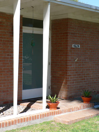 The front door is an original, and only needed frosted film to afford privacy. The security door was removed and a formal planting arrangement added. Original house numbers remain.
 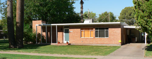 The area in front of the windows had tons of shrubbery ripped out and is currently undergoing re-landscaping to emphasize the horizontal flow of the home's lines. Original flagstone pavers, visible in a different configuration in 1946 photos, have been slowly resurfacing from beneath the thatched-over lawn.
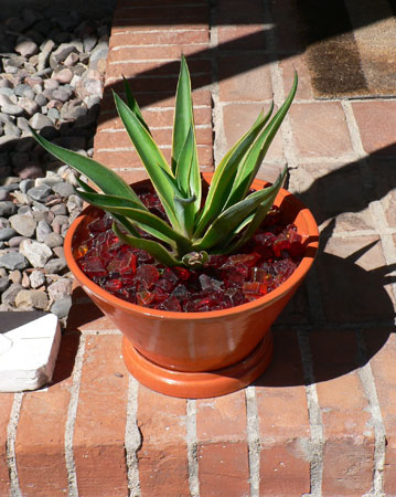 There's nothing traditional about the planters—they're pure, fun, candy-colored pop art.
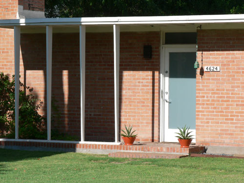
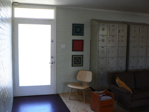 In traditional ranch home style, the home turns it back to the street as there is no front living room window. The entryway is flooded with light from the front door instead. The burgundy pigment-impregnated concrete floor has been painted burgundy.
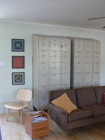 The steel lockers were salvaged from a drugstore going out of business for $200. Afterimage artwork is by Alison King. Furnishings by Phoenix Metro Retro, Vintage Solutions and Design Within Reach.
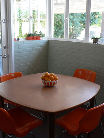 An immediate downsizing of all furniture was required. This vintage leafed Danish Modern teak table and vintage plastic chairs from Phoenix Metro Retro does the trick in the small eat-in kitchen area. The classic corner casement windows provide a flood of light and the 3-inch window ledge supports Alison's prolific cactus and succulent collection.
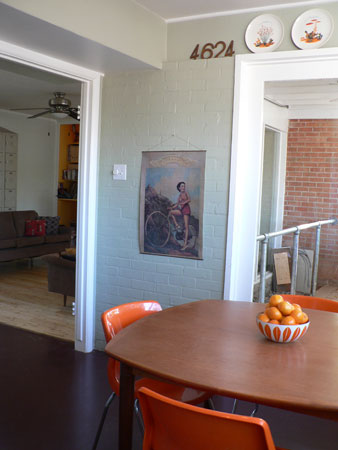
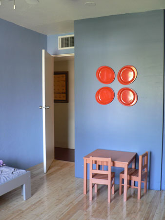 The extra square footage of the Master Bedroom has been given to their 5-year-old son. This volume on the right used to be built-in closets, but has been walled over and reclaimed as extra space for the diminutive bathroom instead.
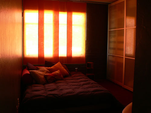 The small master bedroom was completed in 2008 with a dramatic cavelike theme. In contrast to the rest of the light-drenched property, the master bedroom is a retreat from the sun, painted dark gray with blue and orange accents. Light still bounces off the plaster wall and washes forward toward the hallway. The pile of pillows is illuminated by the fierce orange curtains, creating a cool fire pit of briquettes to crash on midday. Anyone who knows of Matthew's love for fire can appreciate the irony.
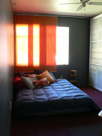 The room is easily restored to light by sliding the curtains. An IKEA panel curtain kit was used but custom fabric chosen for maximum privacy and moderate light. The plaster and brick walls reflect the light differently throughout the day.
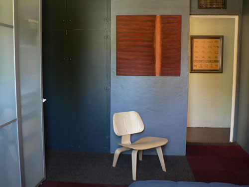 The original built-in cabinets toward the rear were kept but were not roomy enough to hold the clothes of two adults, so a formidable IKEA wardrobe was assembled. The Kings favor less popularized vintage designs, but this iconic Eames plywood chair (first introduced in 1946) was a must-have to recall the home's original era. Interface Flor covers the bare concrete, which is pigment-impregnated burgundy but currently in pretty rough shape. The burgundy color is still used, and a gray area to frame the sitting area.
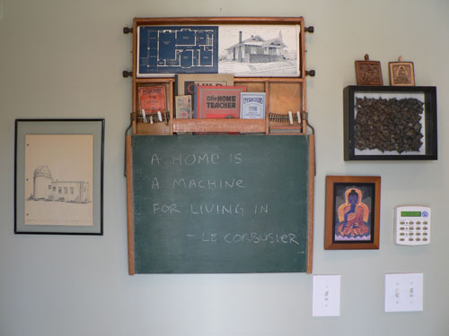 An antique Chautauqua Industrial Art Desk is the turn-of-the-century child's version of "laptop learning", with art and design activities on the upper scroll which could be executed on the chalkboard below. A 1935 pencil perspective class study by Ralph Haver during architecture school at USC hangs at left. Teacher's note in faint red pencil reads: "Perspective off, see me"
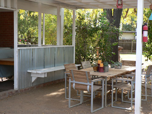 This patio extension along the original covered porch area will eventually be demoed to reveal the angled porch post as a crucial design detail, but works well today as an entertaining area. The partially-enclosed porch on the left serves as a bike garage and shop.
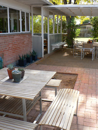 The citrus tree that shaded the kitchen from western sun died in the big frost of 2007, and had to be removed. A water feature may take its place. Pattern, texture and materials really begin to come into play in the back courtyard. A master suite and art studio are planned to be built on the right, partially enclosing and further shading the space.
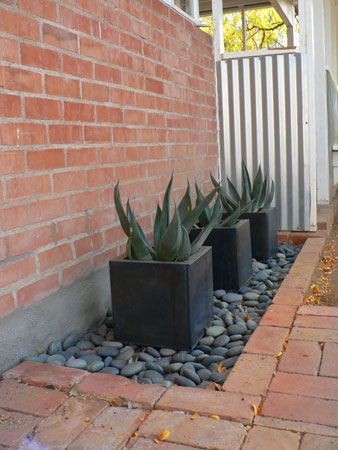 Small enclosed brick planter beds are included in four areas like this around the home's perimeter. A fifth is currently being added out front using steel edging instead of brick.
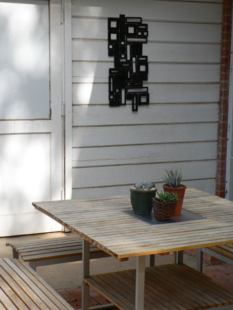 White painted wood plays a prominent role in the materials palette, as in this mid-50s laundry room addition — the only addition to the home. All wood will remain white.
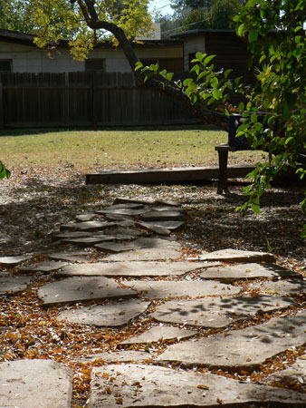 Because the back patio area tended to get irrigated and then never dry out, a meandering salvaged concrete levee was created between the north and south lots.