- Introduction
- American Evan.
- Holy Cross
- First Christian
- St. Vincent
- Mental Hospital
- Glass & Garden
- Los Arcos
- PVUMC
- St. Maria
- Unitarian Univ.
- Crossroads
Holy Houses!
Midcentury Modern Churches from the Iconic Age of Phoenix
 |
|
Come to Wright hoping for complex spatial poetry, and you'll be happier. And here's an authentic, healthy, under-appreciated Wright building in our own back yard, open to the public, sympathetic to visitors. In general the work coming out of Taliesin Associates is not well documented and ranges dramatically in quality and importance. This one is among the best. Unlike other posthumous Wright work it shows the master's touch all the way through, in structure and materials and rhythm. Other excellent local work around Phoenix is the Lykes House, the Ascension Lutheran in Paradise Valley, and the flawed but extremely likable round Music Building on the ASU campus.
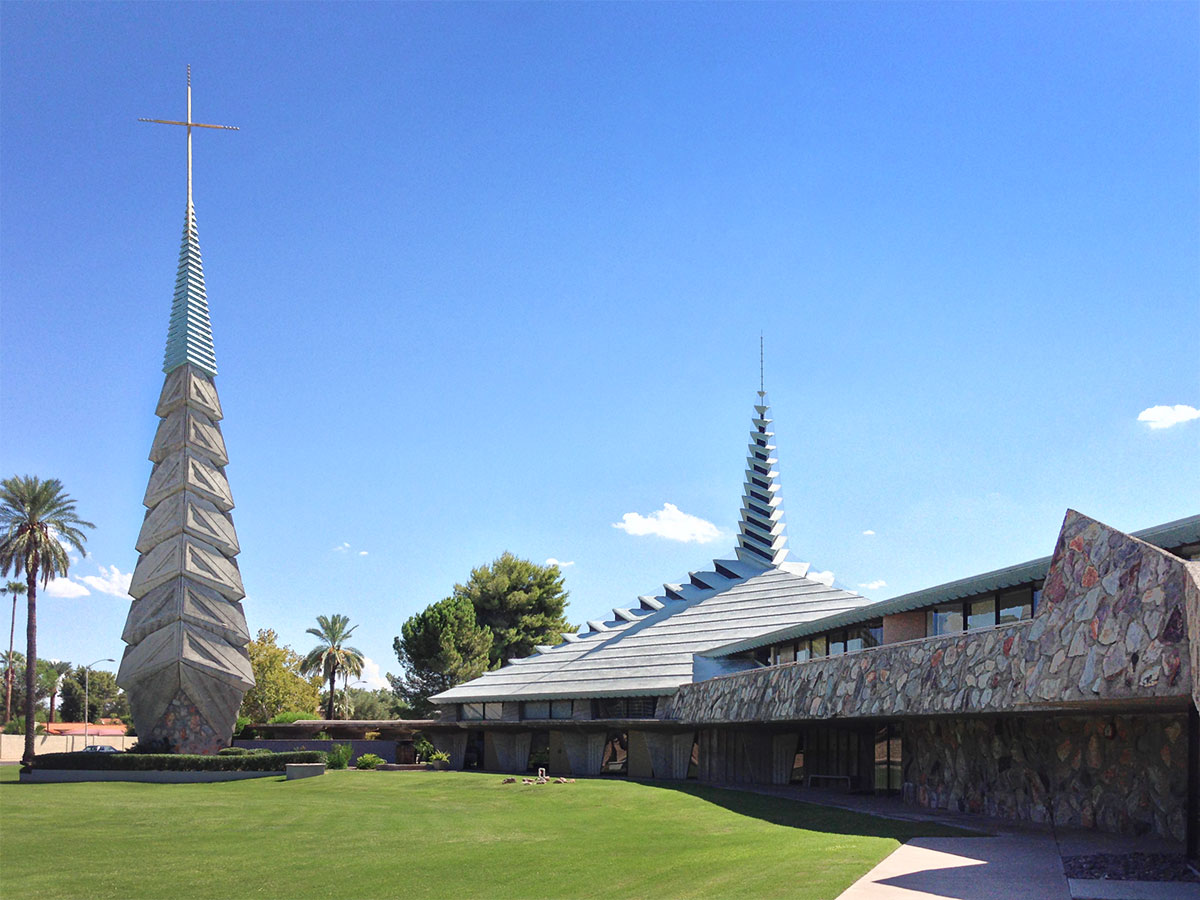 First Christian Church was first designed circa 1950 for another local client, meant as the chapel of an extensive 80-acre campus. That client went bankrupt. The design was revived by First Christian in 1970, in the era when Olgivanna was making design decisions over at Taliesin, and built with only minor tinkering. Wesley Peters had the lead, in the same months when he was courting and marrying Stalin's daughter (...another story entirely).
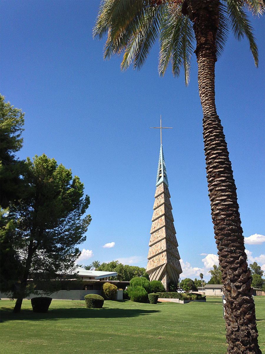
 Here at First Christian the tower will probably catch your eye first. It's 120 feet tall and built to appear triangular from any viewpoint, although it's not. Lay this tower up against the much-discussed recent luminous FLW-inspired tower in Scottsdale, made out of leftover plastic blue Nikes, where this one is serious fieldstone and concrete. It's amazing you can trick fieldstone and concrete into this kind of standing poetry. Where the same materials at the Taliesin campus are used to echo the desert in a way that seems inevitably horizontal, this church is different: an essay in strong horizontals versus strong verticals.
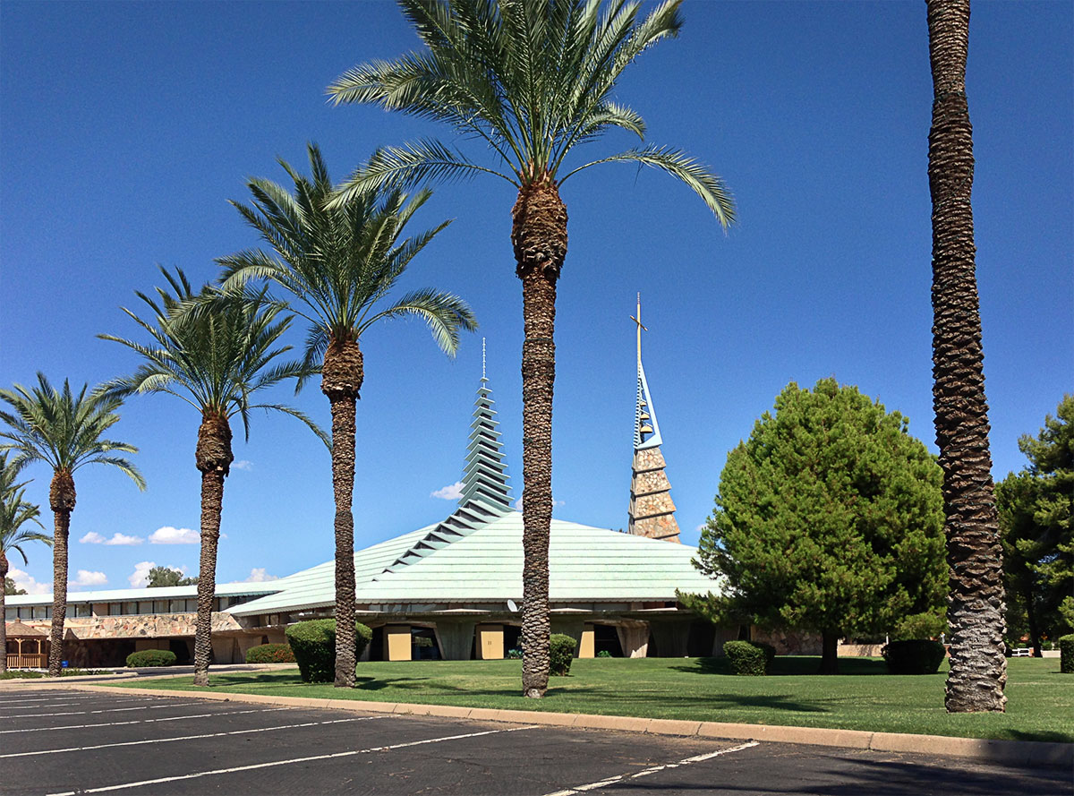
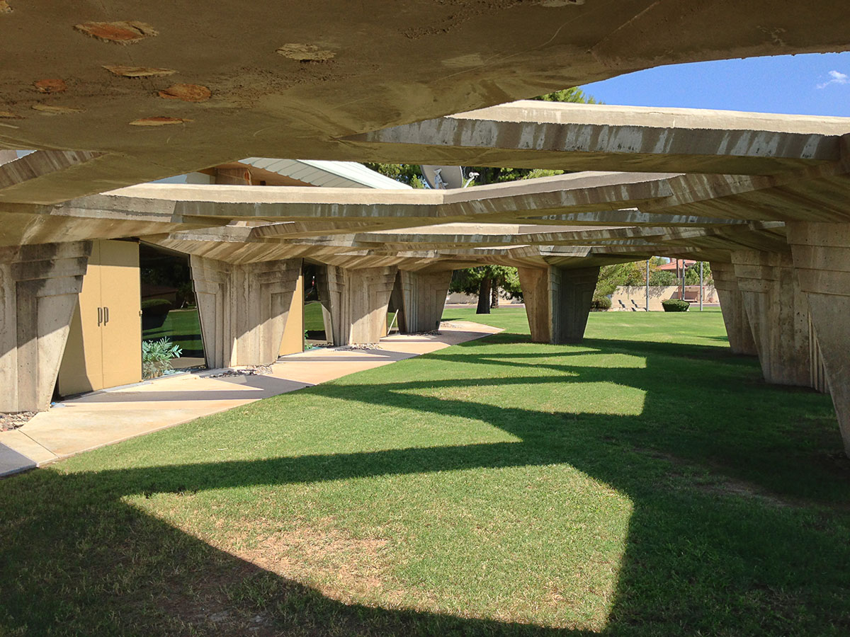
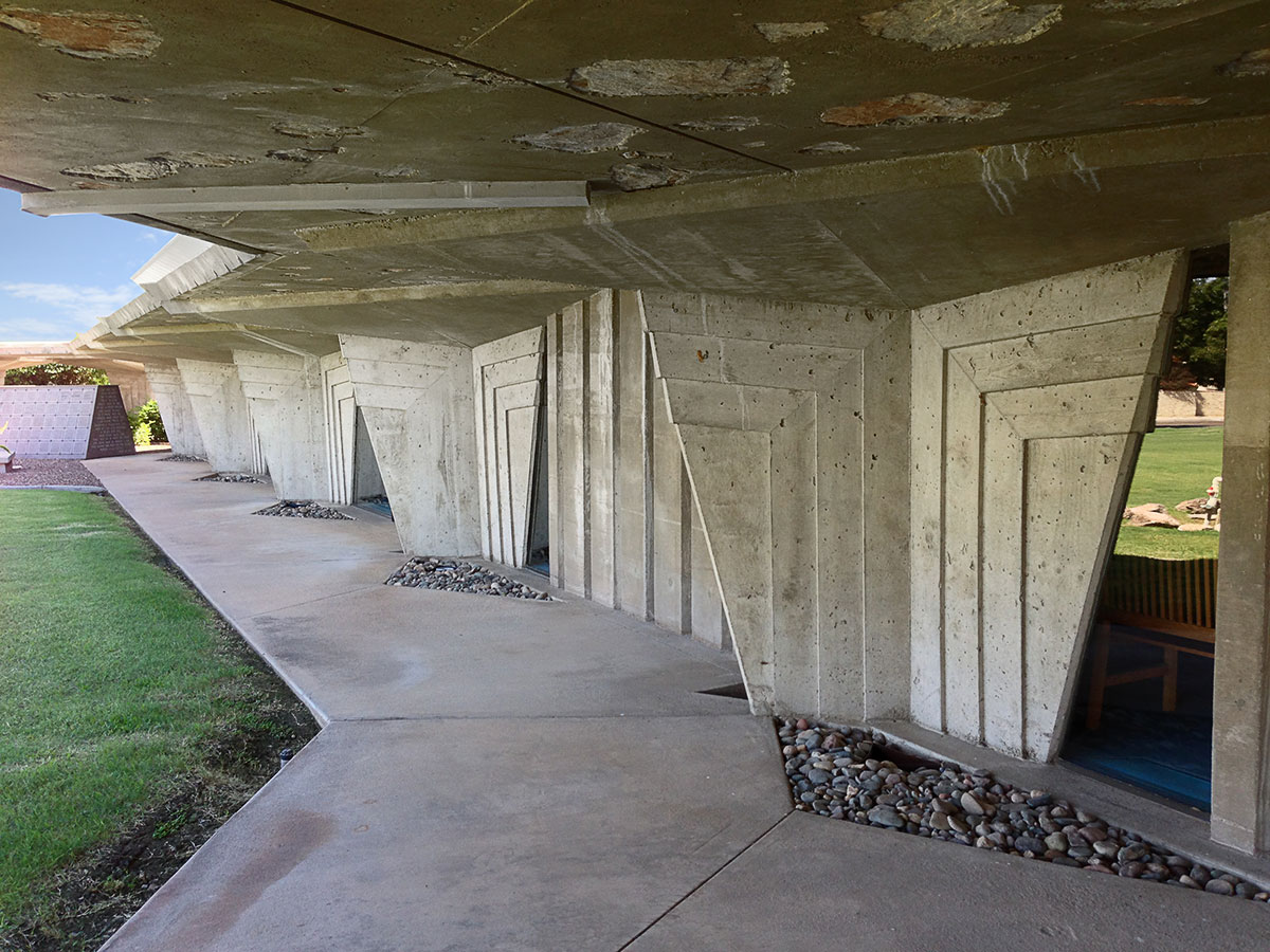 The two verticals are the tower and the steeple. The roof is foam, colored green to seem like oxidized copper because copper would have been too expensive, except copper doesn't oxidize to that color in this climate, so that's a bit of a fudge. Then there are the -- what? The arcades? The outriggers? I'm talking about a half-architectural set of concrete structures that extend from the sanctuary into the yard.
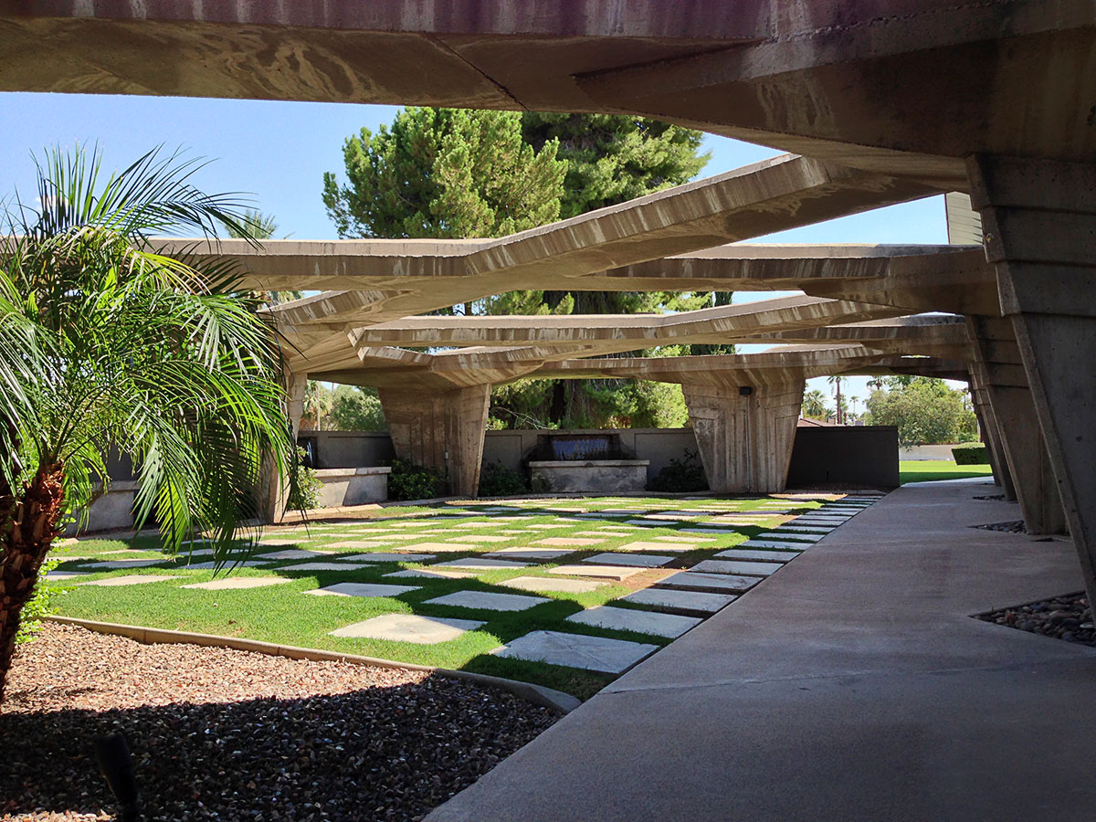
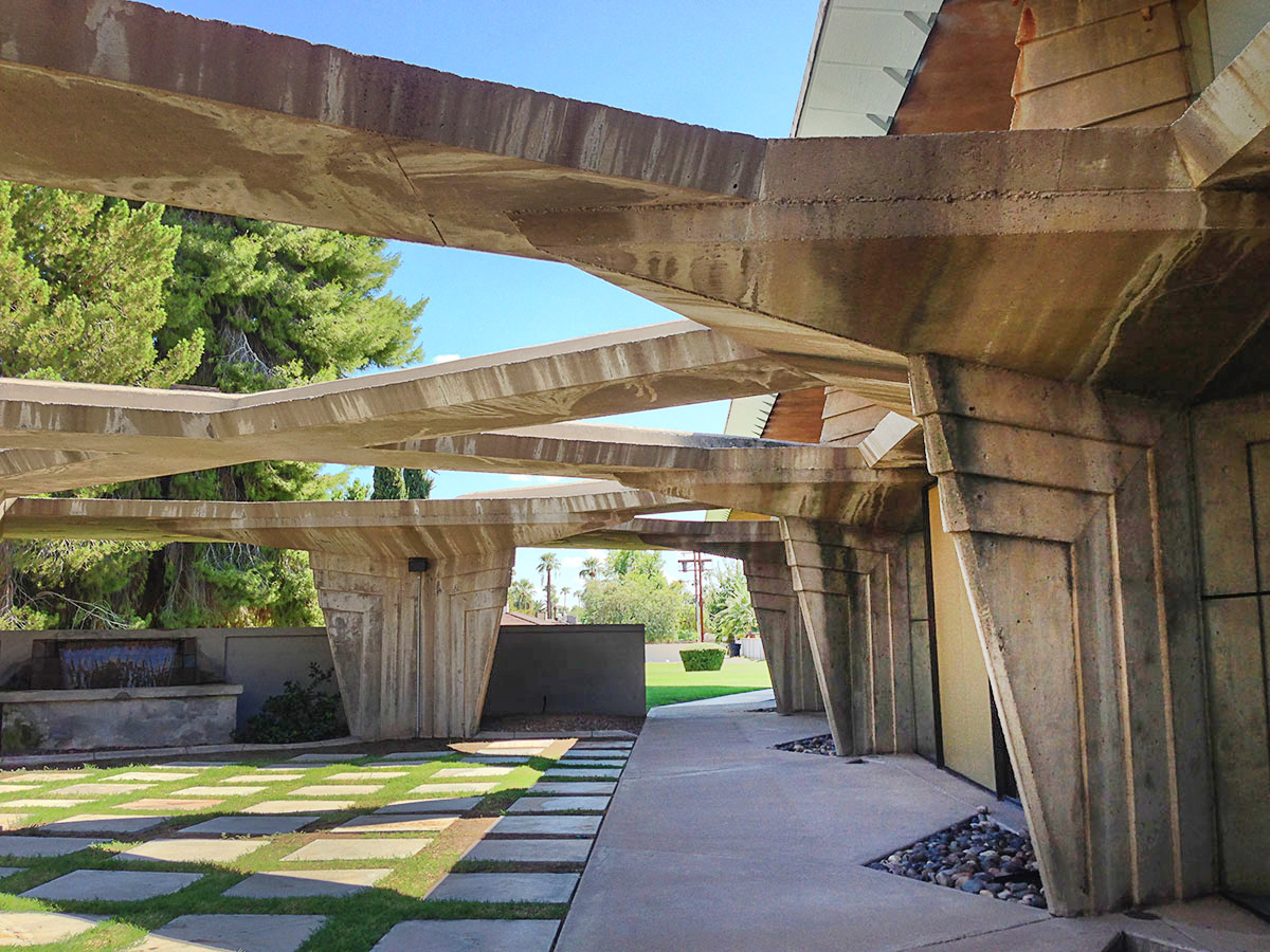 They suggest unfinished framing, or bony ruins, or a concrete grove. They're beautiful because they're mysterious, so let's not overexplain them, except to point out the shape of those patterned, angled, supporting fins are repeated inside. To anybody familiar with Frank Henry's Mushroom Bank, this tactic should seem familiar. These arcades are gratuitous but essential to the relationship of the building to its site, and to the street. You could say there's a difference between physical functionality and psychological functionality, but let's move inside.
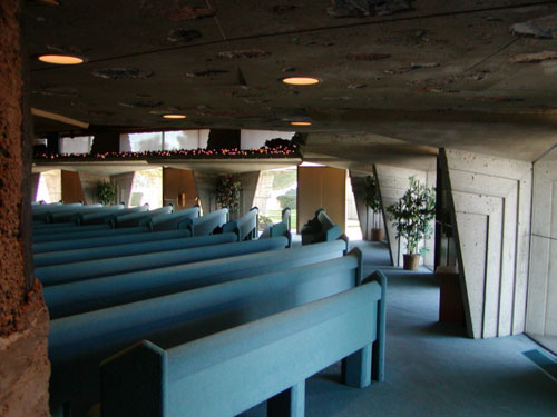 Wander inside First Christian and it feels great. There's a low-ceilinged entry, of course, the signature FLW design tactic for dramatic contrast when you step into the taller main space, the design tactic they now call "embrace and release." What's more remarkable is the off-centered and loose -- but perfectly clear -- flow of the passage into the sanctuary, all the visible and tactile rock-work around you, and those rough concrete fins again.
The structural angles wordlessly suggest reinforcement, as if you're on the bottom floor of a massive building, or deep in a salt mine, which makes the entry into the tall airy sanctuary even more dramatic.
The main space is expansive; it seats about a thousand. And this is the major change from Wright's original configuration. Wright had the pulpit in the center of the space, with seating in the round, and the minister standing centered directly below the system of beautiful blue skylights set into the high ceiling. On Sundays the sanctuary works very well, a comfortable balance. The perimeter sanctuary walls are hard to describe but they'll be very familiar to close Wright observers.
 The sheer pleasure of standing in a Wright space has launched a thousand dissertations (there's an unpleasant thought) but there's no substitute for a visit. Note that the same structure houses a 1979 expansion of administrative space, to the north, also by Taliesin Associates. There's a complete auditorium in there which is not used very often. See it if you can.