
Le Corbusier's Studio Apartment in Paris, 1931
A Virtual Tour by Alison King
First published on The Blooming Rock Blog, August, 2013
 Charles-Édouard Jeanneret a.k.a. Le Corbusier is generally accepted as one of the original fathers of modern architecture. Swiss-born and largely self-taught, he trained through travel and several apprenticeships in Europe, including time with the studio of Peter Behrens in Berlin in the exciting early days when the modern aesthetic and sensibility was still in its infancy.
 Though it took a while for his early work to mature into the iconic style he is internationally known for today, and it took even longer for his ideas to take hold in America, Corbu's enduring Five Points of New Architecture published in 1927 are touchstones that forever changed the way buildings looked first in early modern Europe and then the world.
The Five Points was a manifesto created in response to the heady company of Mies van der Rohe, Walter Gropius, Josef Frank, Peter Behrens and others as part of the Deutscher Werkbund Weisenhof housing demonstration in Germany. While Corbu's ideas were not being exposed for the first time, it was here that the spirit and aspirations of his generation were summarized up on the page. Gropius, Behrens and even Frank Lloyd Wright were already exploring the abandonment of structural walls and ribbon windows up to twenty years before. It was in the Five Points that Corbu's self-driven training in writing, philosophy and the arts converged into a coherent directive not only for his peers but generations to come.
For those of us who grew up in a postmodern world, it can be difficult to imagine a time when buildings didn't take advantage of cast concrete pillar construction, or when horizontal walls of glass were a structural impossibility. It wasn't until the late 19th century that cast concrete construction even began to be taken advantage of.
I can't emphasize enough how important it is to experience architecture in person. Glossy magazines and Phaidon coffee table books can only do so much, it is you who needs to literally step into the picture before you can truly judge whether or not it fits. Now that I've had the opportunity to experience and study Corbu's work in person, I've returned to Phoenix with an even deeper appreciation of what it means for Phoenix's architects to be Corbusian.
For the first two articles on this series of three I'll focus on two of Corbu's masterworks: his very personal Studio Apartment and the iconic Villa Savoye. In the third article, which involves a little audience participation, I'll draw some comparisons between Corbu and local architecture in the Phoenix Metro Area.
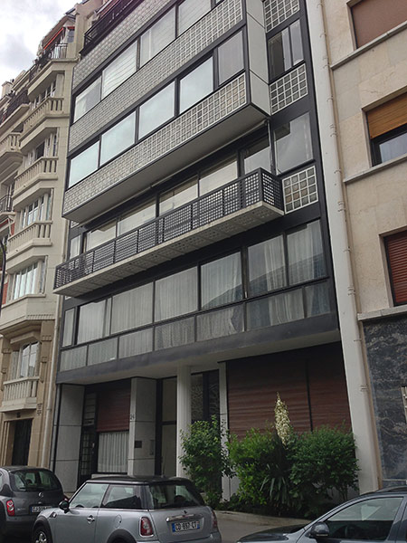 Corbu's Studio and Apartment are located in the Molitor Building, a development project he used to test his theories of the the "Ville Radieuse" in 1931. It is located in the Parc de Princes area of western Paris, a quiet and suburban neighborhood rich with sporting facilities including a racetrack, velodrome and tennis courts. In fact, an entirely new modern stadium facility is being constructed directly across the street. While it dominates the view that Corbu likely planned of the city from his penthouse apartment, it is keeping in character with progress in The City of Light.
See the pillar in the middle of the building's first floor facade? This pillar and others like it are responsible for the new look of this ground-breaking design. Not only does the street level foyer recede beneath the eave of the second floor at Molitor, it is the first apartment building to ever have continuous wall-to-wall glass on the facade. Typically this wasn't possible, because walls provided structure to hold the weight of the building. But with Corbu's new concrete pillar system, the walls were stripped of all obligation to hold anything up and became merely decorative "curtain walls". Liberated of structure by design and avoiding decoration by philosophy, the next next logical step was to use the walls to let in light.
 The variety of ways Corbu employs glass surely isn't a mistake; rather it's an essay on the versatility of different treatments of glass to create a unique and new rhythm. The second story features floor-to-ceiling paned glass, but the third incorporates a balcony and the fourth begins a trio of cantilevered bump-outs in an engineering feat of daring-do.
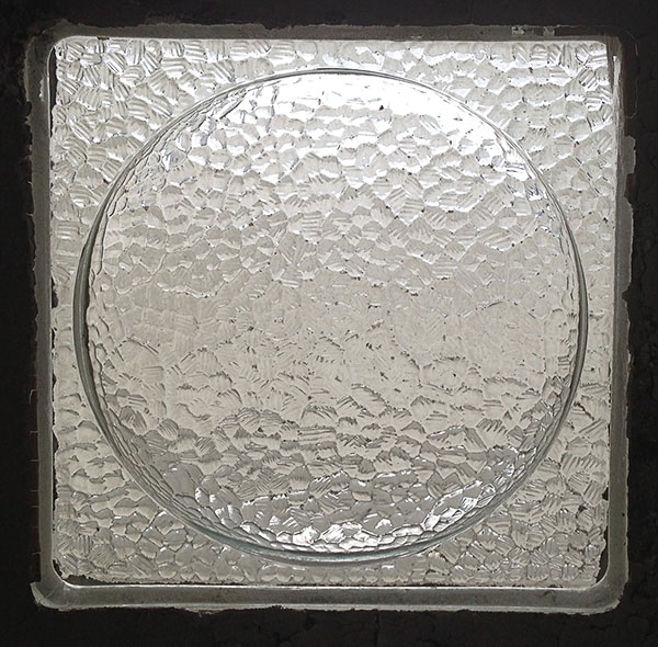
The grid of squares on the exterior appears opaque by day, but in fact they are grids of thick and mottled Nevada glass block impressed with a flattened bubble shape, allowing the entire facade to illuminate as a wall of light.
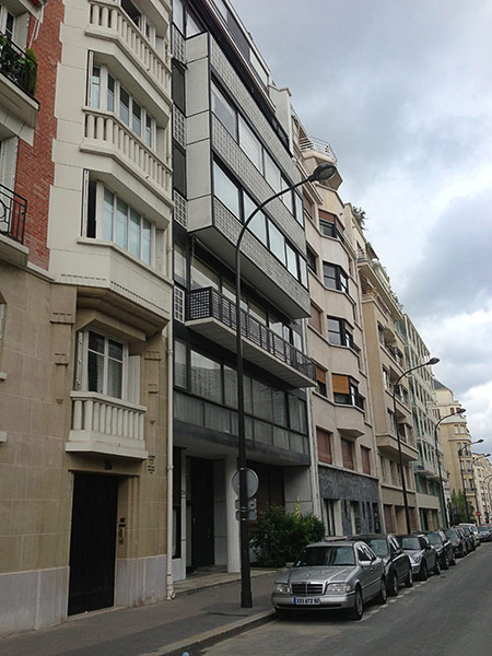 The buildings that surround the Molitor illustrate the old method of construction, using quarried stone or brick. Narrow windows tended to be vertical, and certainly not unbroken horizontal ribbons like their modern new neighbor. The horizontal windows are one of the Five Points of New Architecture that Corbu developed in 1927.
 The deep entryway of the Molitor illustrates the structural freedom of his piloti system, a second Point of New Architecture. What is a plioti? Simply put, it is a pillar. You might also think of them as stilts. Reinforced concrete columns are strong enough to prop up the floors, enabling a free flow of modular space that can be subdivided as desired. The effect can be most dramatically observed in his Villa Savoye (but that's another article, another day!).
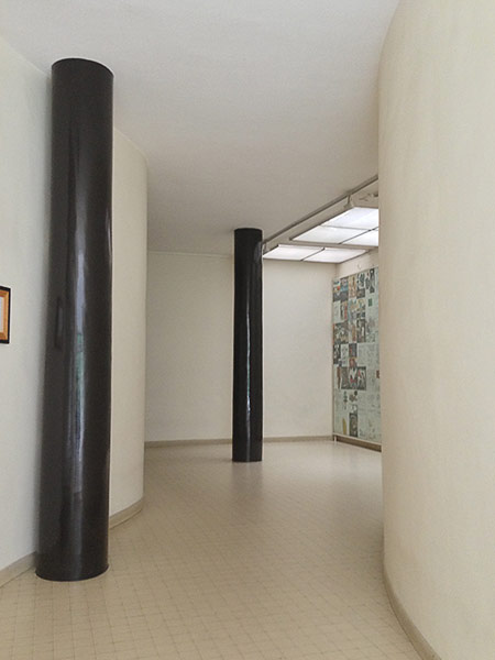 The "flowy-ness" of space is immediately expressed upon entering the apartment's ground floor. Curvilinear walls meander through the contrasting piloti and past a skylit installation of Corbu's "Poem to the Right Angle", a series of lithographic illustrations and observations on architecture. This demonstrates his third point of New Architecture -- the open floor plan. This is a concept we completely take for granted today. Imagine a world where buildings were compartmentalized by necessity and windows were narrow and limited. Now you know the world the early modernists were shaping.
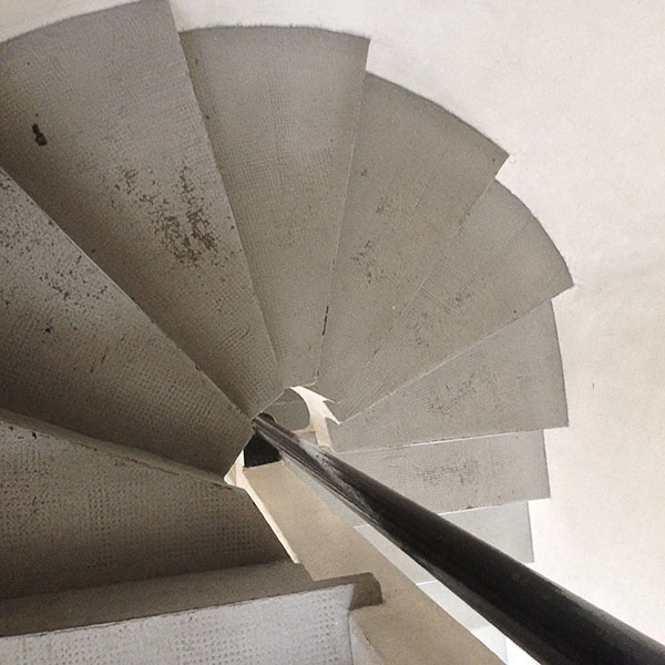 Prepare to take six flights of stairs up to the top floor of the Molitor, which houses the museum. The central pole railing is a consistent Corbu touch. Rather than cling with one hand to an outer rail, a single pole is all that is needed, nothing more. The physical effect as a user is much like holding a shepherd's crook to climb a craggy mountain. In a way, it is universal design at its best as the pole may be grasped at any height.
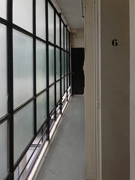 Each landing between flights gives access to the apartments, which are currently occupied. The landing faces the central courtyard core sandwiched between buildings, letting in plenty of natural light. The top and bottom rails let in fresh air while the mottled glass affords privacy and a modest buffer from the elements.
  Upon entering the apartment, you immediately encounter a writing nook where Corbu did his correspondence. Because his penthouse occupies the top floor of the Molitor building, his roof is different than the rest. Note the walls are arching toward us.
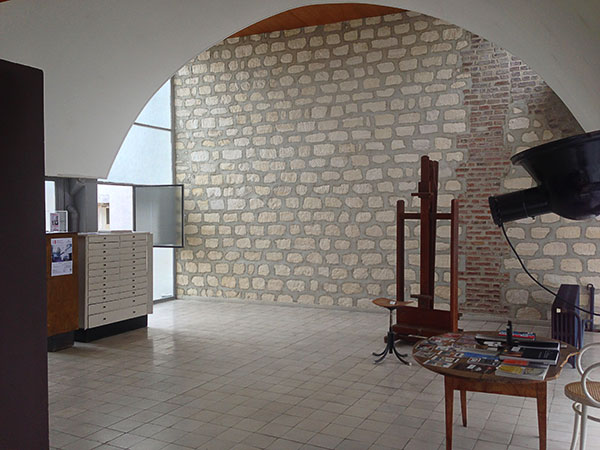 Here's why. Turn around and you're immediately inside his painting studio, aglow with soft light coming in from both the east and west facing windows. A barrel vault defines the space. Corbu wanted to capture the essence of light in the Mediterranean, so especially on this overcast day there's plenty of light bouncing around with not a harsh shadow to be found. The large industrial lamp on the far right washes the the vault with light when needed at night.
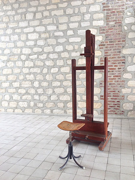 The rough-hewn white stone wall is a surprising and organic curiosity, isn't it? It's the preexisting wall of the apartments next door! Corbu saw no need to build an additional interior wall of his own and used what was there, letting the material express itself. He liked the contrast of old and new, thinking that the new modern design looked even moreso in such close proximity. The "rough and clean skin" of the wall spoke to him.
It is here at his easel that he pursued his first love, painting. Corbu first trained to be an artist; it was only with much persuasion of his mentors that he explored architecture. Lucky for us, he stuck with it.
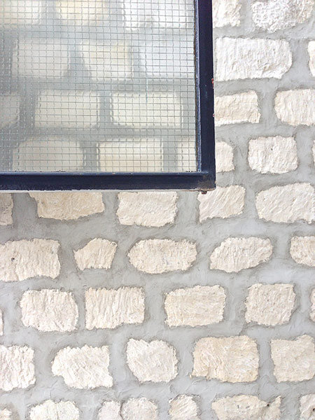
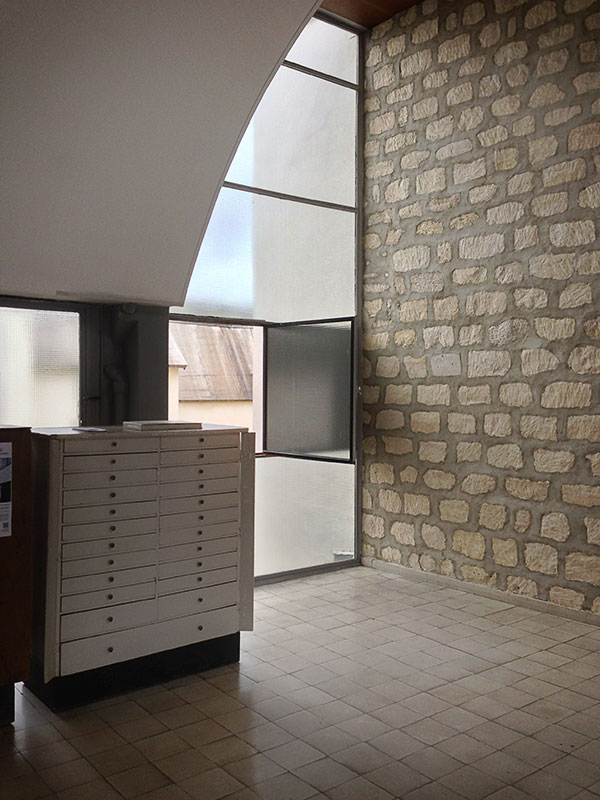 Just seeing his flat files in person gave me the chills. He adored his studio and the artist in me can see why. It would be easy to become intoxicated by the light alone.
 From the studio, a series of oversized pivot doors guide guests toward the living portion of the home. When fully opened, his concept of an open floor plan is most evident. He was very much concerned with the "promenade" or walk-through in space. The oversized doors allow passageways to blur lines between rooms and partition off private and public spaces as needed.
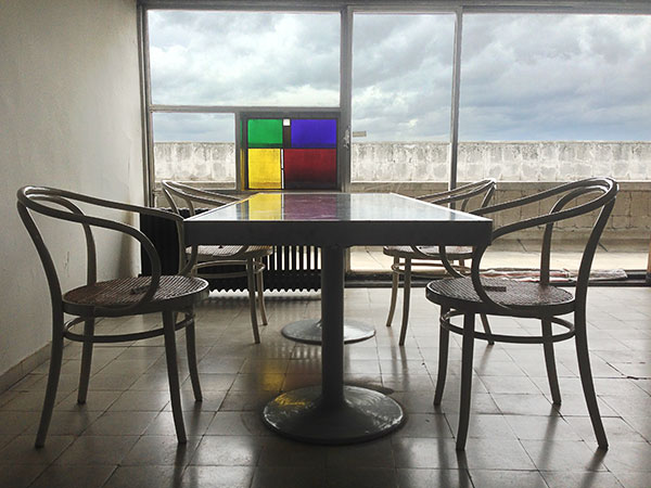
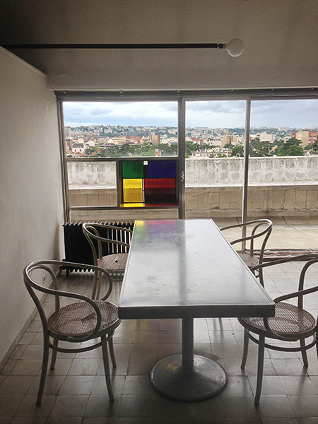 In the dining room, a marble tabletop with two heavy trumpet-bell bases and quaint Thonet chairs await. Many don't believe me when I report that the Thonet chairs are his choice. While the chairs may look old fashioned by today's severely modern standards, Thonet was actually one of the most innovative users of steam technology in the industrial age, bending wood into shapes never before seen and creating some of the most iconic and comfortable chairs of his time.
 As a fellow furniture maker himself, something timeless and functional about Thonet must have appealed to Corbu. He trusted the Thonet brand with the manufacture of his own furniture line. The lip of the marble slab table is raised, and he claims to have been inspired by a mortician's examination table. It is a detail that will carry over into the kitchen surfaces with some morbid effect.
 I bet you were admiring the view! Which brings us to his fourth and fifth Points of New Architecture; liberated from providing structure, free-floating facades can capture stunning views, and lead to rooftop gardens. This short concrete block wall is all that stands between you and the city beyond! Even in the middle of a growing city nature is drawn near. His bed was expertly positioned on high stilts to capture such a view from the room next door.
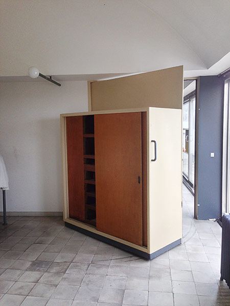 A clever built-in cabinet hides on the backside of a large pivot door that separates the dining room from the private bedchamber. Corbu once said "A home is a machine for living", and this principle is most aptly expressed here where the distinction between furniture and house is inseparable. Note the unusual pipe-mounted light fixture here, in the dining room and kitchen; it's an extremely utilitarian interpretation of a chandelier.
 The washroom holds several surprises as well. The industrial design of porcelain fixtures and their knobs seem trapped in a world decades behind in catching up to his.
 I would like to think he brushed his teeth here often, using these enameled holders for his cup and soap. The marble mosaic tile is rustic and imperfect where it abuts the plaster.
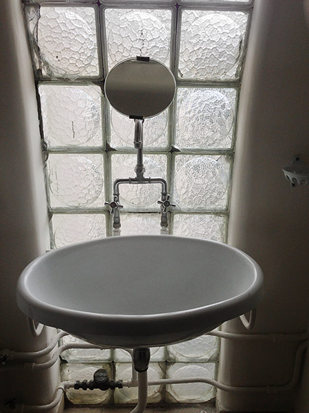 The upstairs guest bathroom is tucked into the cove of the vault, and the glass block arches toward you. Typically reserved for servant's quarters due to less headspace, Corbu tucked the guest quarters away here instead.
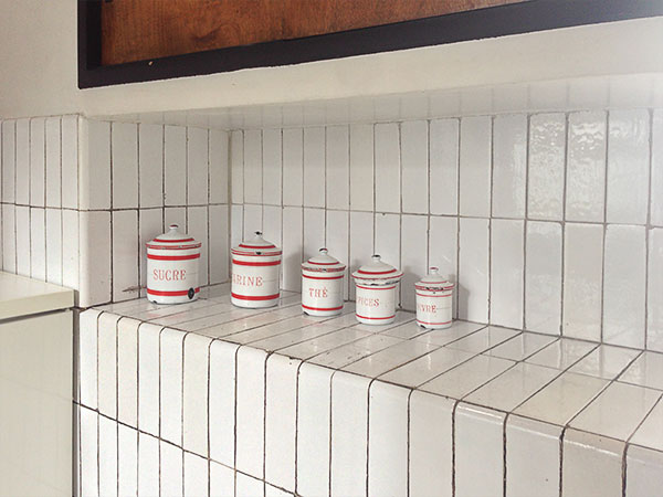 The kitchen treads the line between institutional and rustic. The vertical glazed subway tile is a huge surprise and a trend we've seen resurfacing in the last five years.
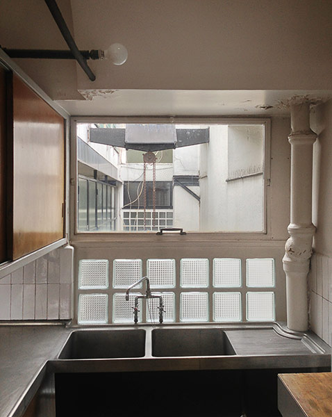 The kitchen sink affords a beautiful view of the industrial gantry used for moving furniture up into the building. The integrated sink and work surface are pewter with a generous lip, again inspired by a mortician's table.
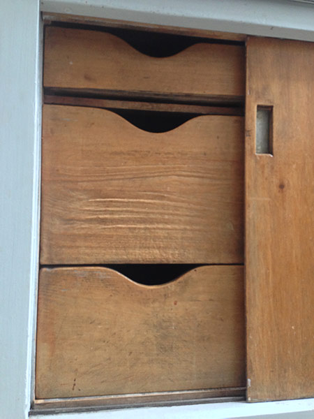 The cabinetry is rustic, minimalist, efficient and well-machined all at once.
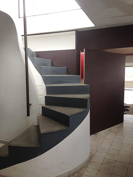
 Up the iconic spiral stair, again with only a central pole and now no coiling plaster wall to hold you in!
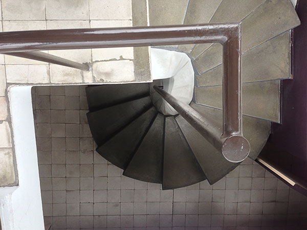 The simplicity of the single vertical railing is just astonishing.
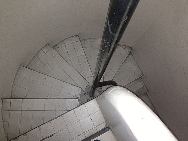 Another
stairwell leading to the second rooftop garden.
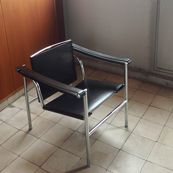 It's comforting to see a Corbu chair its native environment -- a Corbu House -- with all the imperfections of age and love over the years, especially in comparison to the artifice of glossy magazines! Like Corbu's studio wall, this place is the real deal.
The apartment was listed on France's national register of historic places in 1972. If you plan to go, the studio museum is managed by the Fondation Le Corbusier at 24 Rue Nungesser et Coli, Paris. Tours are self-guided with generous PDFs available online as a guide.
In review, here are Le Corbusier's Five Points of New Architecture:
- Stilts, aka piloti
- Rooftop gardens
- Open floorplan
- Free-floating facades
- Horizontal windows